
How to increase website conversion in the e-commerce niche: 14 ways

Table of contents
It happens that a company advertises and invests in SEO optimization, but sales are still low. At the same time, there is traffic on the website, but visitors are not in a hurry to take targeted actions. The team of the Ringostat platform has described 14 ways to increase conversion. And provided good examples.
1. Clear navigation on the website
Make sure people understand how to navigate the website, where to find the right products, contacts, and place an order. Stick to these principles:
- most websites have a menu located on the left or at the top, so it's better if it's in a usual place;
- navigational elements should be noticeable, visitors should not wander around the page looking for them;
- always show the user where they are, how to go back a step - you can use subsections and "breadcrumbs" for this;
- if the range is wide, add filters so that the customer can quickly choose the desired product by setting several conditions.
2. Loyalty program
According to Stanford University research, 46.1% of people assess a company's credibility based on the design of the website. So don't skimp on the appearance of the website. Even a small company can create an online store on trading platforms that have ready-made design templates. Or use a website builder.
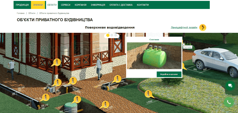
If your online store sells specific, industrial, or technical products, use graphics to explain their features. For example, one of Ringostat's clients is Standartpark, a company that deals with drainage devices. The website clearly shows the features of the products and where they are used exactly. Even without knowing the exact name of the product and the section to look for it, a person can go directly to the desired page from the image.
3. Visible phone number
There are many niche businesses where the application starts with a phone call. Therefore, a website without a phone number raises doubts among customers. Can this company be trusted, or is it a fly-by-night company that hides its phone number?
At the same time, the number can be on the website, but in the footer or in small print on a separate page - which further complicates the customer's path. Therefore, it is better to show the number immediately on the homepage. Especially in topics where people call to make sure the company is reliable: education, medicine, real estate, etc.
Important: if your customers most often place orders by phone, be sure to use call analytics. Otherwise, you won't know which ads convert to calls because Google Analytics cannot track phone calls. But if you connect a call tracking service, its reports will collect information about which source, channel, campaign, and keyword led to each call.
Don't forget about other contacts: address and email. If your office is not easy to find, publish a map or a photo of the area. This once again confirms that the company exists and anyone can contact it at any time.
4. Fast loading speed
Aberdeen Group found that a 1-second delay in website loading reduces conversion by 7% and customer satisfaction by 16%. Modern users are becoming less patient. So make sure your website loads fast enough.
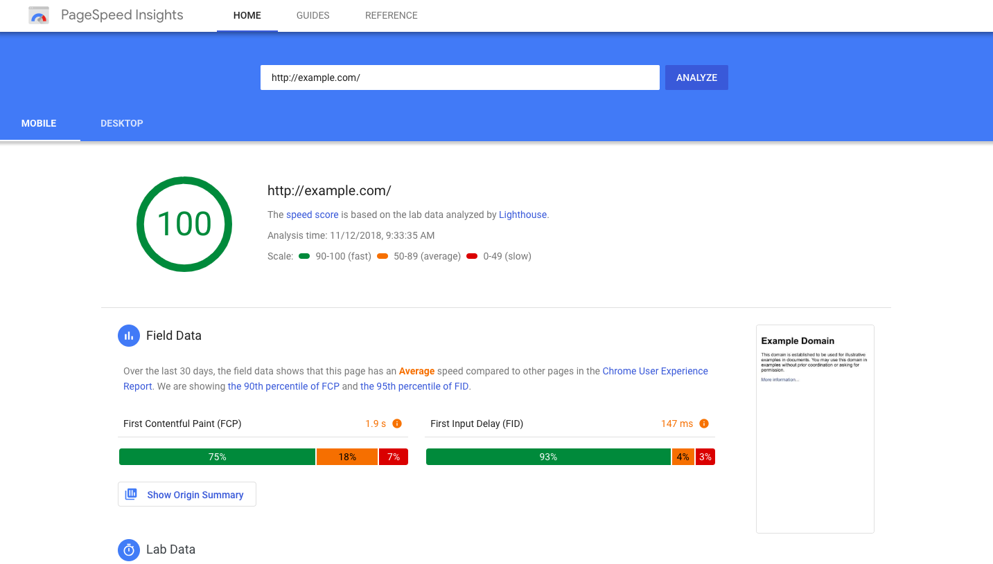
You can do this, for example, using Google's PageSpeed Insights. The service will show you the loading issues on desktop and mobile. It also provides advice on how to fix them.
5. Clear call to action
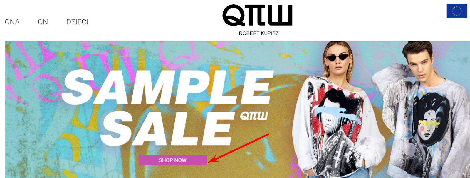
Imagine entering a website and your eyes immediately widen from various calls to action. The banner on the right encourages participation in a promotion, a pop-up window suggests signing up for a newsletter, and the main screen encourages going to the catalog of a new collection. Your attention is literally torn apart.
Don't overwhelm the visitor because too many choices will paralyze them. Let there be only one CTA on one screen - this way the likelihood that the user will take the desired action is higher. For example, on the homepage, you can offer the "product of the week". To understand which call to action works best, conduct a series of A/B tests and choose the best one in terms of conversion growth.
6. Landing pages for contextual advertising
If you run contextual advertising for specific products or categories, the ad should lead not to the homepage, but to the product page. It is unlikely that a visitor will want to spend a lot of time on the website if they don't see the desired product immediately after clicking. An additional advantage of a landing page is that it contains a call to action that refers to a specific product. This way, the user's attention is not scattered, and the likelihood of a targeted conversion increases.
7. Responsive layout or mobile version of the website
Over half of website visits worldwide come from mobile devices. But some companies still ignore this point - and in vain. It's no wonder that in this case, the website's conversion will decrease because the percentage of mobile traffic is increasing. Assess for yourself whether you would like to order goods from a mobile phone if:
- nothing is visible on the small screen, the website is too wide and does not "adapt" to the size of the smartphone;
- you have to fill out a form consisting of several lines using the phone's keyboard;
- you need a product/service right now, but instead, you have to search for information on a website that is not suitable for mobile devices.
Most likely, you will simply go to another company's website that has taken care of smartphone owners, right? To prevent the company from losing customers in this way, it is better to take care of a responsive layout or a mobile version of the website. Which one suits better depends on you.
8. Chat, callback form
Don't wait for the visitor to contact you - provide them with personalized product recommendations. Otherwise, the customer may silently leave the website if something is unclear, they doubt, or cannot find the right product.
You can also encourage a person to engage in a dialogue through a chat and a callback form. However, keep in mind a few things:
- the chat or form should not be intrusive, constantly popping up or covering half of the screen;
- it is best to be able to choose the color and configuration so that the chat or form matches the look of your website - below is an example of such settings for the Ringostat callback widget;
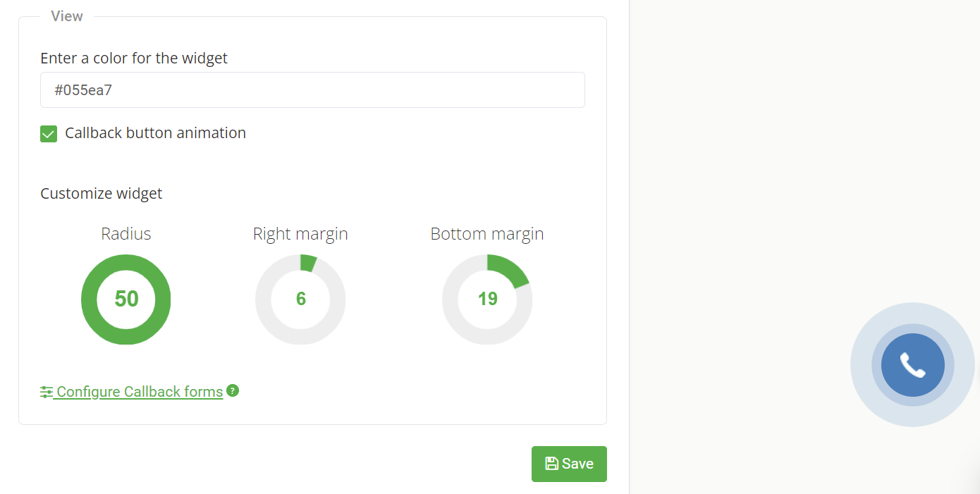
- you need detailed visit statistics through the chat or widget - otherwise, you won't know which advertising channels bring conversions.
For the website, it is better to choose "smart" chats and callback forms that can be configured for more complex actions. And even evoke a wow effect in potential customers. For example, in Ringostat, you can configure a callback to work when a customer fills out an online application. The manager will immediately contact the potential buyer, and this will help increase the website's conversion.
9. Delivery and money-back information
These two parameters are considered by Google as a prerequisite for websites displaying product ads. This indicates the credibility of the campaign. So even if you don't plan to advertise the product, it is better to indicate such conditions. This way, you will additionally convince customers that they can trust you. Specify:
- what delivery services you use to send goods;
- the delivery principle: to the warehouse, to the door, etc.;
- conditions under which the goods can be exchanged or returned;
- the time frame for doing so.
If possible, offer free shipping. For many buyers, this is a decisive factor when placing an order.
10. Social proof
People tend to draw on the experiences of others - according to Zendesk, 88% of customers read reviews before purchasing a product. You can use social proof to increase conversions on your website.
Place information on the website that convinces visitors that it is worth ordering your product. For example:
- reviews - it is important that they look "live" and come from real people;
- a list of well-known customers;
- photos or videos from customers who have already received your product and were satisfied;
- a review of your products - it is better if it is in video format, where a vlogger discusses the features, equipment, and shows the strengths of the product;
- the number of companies or individuals already using your product;
- awards, membership in niche organizations.
11. Helpful information
This is especially important if you sell specific products whose features are not easy to understand right away. What content can be offered to visitors:
- FAQ - tell in detail how to order goods, who may need them, how often there are discounts, etc.;
- blog - it is suitable for showcasing the advantages of your products and increasing traffic for information queries;
- reference information - these can be legal standards, descriptions of materials and technologies used in production;
- tips - a good option for multi-page websites - if a customer goes to a specific thematic section of the website, inform them about an article explaining specific points.
12. Simple purchasing process
The more fields a person has to fill out to make a purchase, the less likely they are to do so. Do not ask for more information than is required to place an order. In addition, detailed inquiries are also perceived as a violation of privacy. Ask only for the name and email address or add the option to log in through social networks. Do not ask the customer to register. Few people want to come up with and remember a password, then confirm the email address, log in again, etc.
13. Recommended products
Don't wait for the customer to find the right product - recommend a product right away. Consider social proof. Seeing that a product is popular, the buyer may become interested in it. You can also show what others often view and recommend if you have a rating and review system.
14. Abandoned cart reminder
It happens that a visitor to an online store selects a product but does not pay for the order simply because they forgot about it. Don't lose visitors who almost became your customers. Remind them that the product has already been added to the cart and is waiting for payment.
This can be done in several ways:
- mailing with a reminder - in it, you can also offer a better price to finally convince the customer;
- remarketing - the person will see the reminder on partner websites of the appropriate network;
- triggered push notifications - a pop-up window with information about the product from the abandoned cart will appear on the user's screen.
Summary
There is nothing difficult in the rules of increasing website conversion - make it easy for a person to make a purchase, and there is a high probability that they will do so. If you really can't influence the price or quality of the goods, at least provide the following points:
- prove that you can be trusted;
- show the strengths of the product, describe its features;
- do not force to fill out long forms and enter personal data;
- offer multiple communication channels, etc.
Please rate this article
Try our new
Local SEO tool
Manage and track visibility of your
Google Business Profiles
